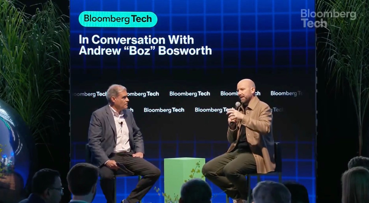

Meta CTO Andrew “Boz” Bosworth, who was one of the company’s first 15 engineers, published a memo earlier this year forecasting that 2025 could be the year of greatness for Reality Labs, the company’s augmented and virtual reality unit. Or, it would be the year when the metaverse goes down as a “legendary misadventure.”
These days, Boz appears to be leaning towards its potential for greatness. But, the market will be the final determinant.
“We’ll judge at the end of the decade, but this does feel like the pivotal year,” Boz said Thursday during a Bloomberg Technology interview.
Boz noted that Meta’s Ray Ban AI glasses had been a breakthrough that excited both consumers and competitors. As of February, Meta has sold more than 2 million pairs since their October 2023 debut. Last fall, they outsold traditional Ray Bans, even before Meta rolled out AI features.
Meanwhile, Google last month announced partnerships with Gentle Monster and Warby Parker to create smart glasses based on Android XR. Apple is also reportedly making a push to release smart glasses in 2026.
“Suddenly, we go from toiling in the realms of obscurity to being very much in the world with a product that is very attractive to consumers, and thus competitors,” Boz said. “The clock has started on competition coming, and that just means that the progress we make in this year is of disproportionate value to any year before or after it closes.”
Still, competition among other incumbents means nothing if the market doesn’t adopt Meta’s AR and VR products, which is what would drive the industry to standardize the technology.
“The market is actually, especially when it comes to hardware, a trailing indicator,” Boz said. “So you look for early indicators. To some degree, you do have to have a level of confidence and taste in-house.”
He said this was something he learned from Sheryl Sandberg, former chief operating officer at Meta.
“Sheryl used to always talk about how most companies don’t fail because they got beaten by a competitor,” Boz said. “Most companies fail because they didn’t execute their own plan correctly. And so what I try to do with the team is really focus us, not so much on the competitive landscape as on [whether] we’re executing to our standards.”
The Meta CTO said the company has “a set of ambitious plans for the year” that it is on track for.
“What we’ll know by the end of the year is whether we executed on our plan or not,” said Boz. “What we’ll know in five years time is whether that was enough.”
Keep reading the article on Tech Crunch

Representatives Yvette Clarke (D-NY) and Beth Van Duyne (R-TX) launched the bipartisan Congressional Creators Caucus on Thursday, which aims to support the creator economy.
Though it once seemed like a pipe dream to make a living on the internet, this industry has become a reality — Oxford Economics estimates that YouTube’s ecosystem alone powered over 390,000 full-time equivalent jobs in 2022, while Goldman Sachs estimates that the creator economy could be worth half a trillion dollars by 2027.
But the U.S. government doesn’t have much regulatory oversight or understanding of the creator economy as it stands, leaving creator businesses in a bind.
“As digital content creators’ online presence continues to reach billions globally, Congress must work to ensure resources and protections are in place to support their success in this new era of start-ups,” Representative Clarke said in a statement.
Matthew Patrick (MatPat) and Stephanie Patrick, who founded the popular digital production studio Theorist Media, spoke at a press event for the launch of the caucus. The husband and wife duo have spent over a year lobbying on Capitol Hill to advocate for creators’ needs.
“We’re trying to educate lawmakers about what the creator economy is, and that it’s an actual job and that we are actually small businesses, and as a result, there are certain tax codes and things that apply to small businesses,” Matthew Patrick (the creator known as MatPat) told TechCrunch last year. “Even when you talk to accountants, they’re like, well, are you though? Because there’s not a clear indicator on tax forms — like, what is a creator business?”
The Patricks have also pushed to point out that the creator economy isn’t an industry confined to the coasts, in entertainment industry hotspots like New York City and Los Angeles — rather, it’s an industry that needs support across the nation. Theorist Media and MrBeast, the most popular YouTubers in the world, are both based in North Carolina. Meanwhile, John and Hank Green have used their success on YouTube to launch businesses like the educational media company Complexly, which has headquarters in Indiana and Montana.
Patreon and YouTube, two of the most vital companies that help creator businesses operate, have affirmed their support for the new caucus.
As a Patreon blog post explains, creators often build businesses without the same protections that more traditional businesses have, like insurance, disaster relief, and access to loans. Even startups like Karat Financial have sprung up to fill in some of these gaps, providing business credit cards and banking to creators who are often denied these services because legacy financial institutions don’t understand their businesses.
“Too often, creators are overlooked in economic policy discussions—despite being small business owners, employers, and cultural tastemakers in every congressional district,” explained Courtney Duffy, Patreon’s Head of External Affairs and Strategic Engagement, in a statement. “The bipartisan Congressional Creator Caucus is a crucial step toward recognizing their impact and ensuring they have a seat at the table in shaping the policies that affect their livelihoods.”
Keep reading the article on Tech Crunch